Visitors rarely read your website. They look at it, form a feeling in a few seconds, and either scroll on or reach for the contact button. Design is what shapes that feeling.
This article covers the design side of conversion: the layout choices, buttons, forms, and trust signals that quietly move a visitor toward contacting you. The words matter too, and they’re covered in the website copywriting guide. The testing discipline that ties it together lives in the conversion rate optimization guide. This is the visual half of that story.
Why this matters
A website that looks fine can still be losing most of the people who visit it, for reasons that have nothing to do with what it says.
- Visitors judge before they read. People form an impression of a page in well under a second, and that first feeling colors everything after it. Cluttered, dated, or confusing design gets a verdict before your headline gets a chance.
- Confusion loses more customers than ugliness. A visitor who can’t tell what to look at next doesn’t struggle on; they leave. Most conversion problems are really clarity problems wearing a design costume.
- Design is a trust signal in a market full of burned buyers. Your visitor has hired the wrong company before. They’re scanning for reasons to believe you’re different, and a careless website hands them a reason to keep looking.
- Traffic is expensive; persuasion is a one-time fix. Every ad dollar and every month of search work sends people to the same page. Making that page persuade is the cheapest improvement in your whole marketing budget.
The elements that do the persuading
Six things carry most of the load. None requires a redesign; each can be fixed on its own.
1. Visual hierarchy.
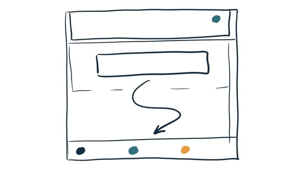
The page should answer three questions in order, at a glance: what is this, why should I care, what do I do next. Size, contrast, and position are how a page points. If everything is big and bold, nothing is, and the visitor’s eye wanders until it leaves. One clear focal point per screen.
2. The call-to-action button.
One primary action, repeated down the page, in a color used for nothing else. Make it look pressable, put it where the eye lands, and label it with what happens: “Get a free quote” beats “Submit.” Everything else, like directions or brochure downloads, is a secondary link that stays visually quiet.
3. White space.
Empty space isn’t wasted space; it’s emphasis. Crowded pages read as effort, and effort on a phone reads as leave. Generous spacing around your headline and your button makes both stronger without changing a word.
4. Forms that respect the visitor.
Every field you add costs you responses. Name, contact method, and one open question is enough for most service businesses. Ask for the rest after they’ve raised their hand, not before.
5. Trust elements.
Reviews with names, photos of your actual work and your actual face, recognizable badges, years in business, service area. Real specifics beat polish: one named review with a detail in it outweighs five anonymous five-star blurbs. Stock photos of smiling strangers actively cost you credibility.
6. Speed and mobile fit.
More than half your visitors are on a phone, often on a job site or a couch, and a slow page is a design failure no visual choice can rescue. Big text, thumb-sized buttons, images sized for the web. The image organizing article covers the resizing habit that keeps pages fast.
Putting it to work
- Run the squint test. Pull up your homepage, squint until the words blur, and notice what stands out. If it isn’t your headline and your contact button, your hierarchy is pointing at the wrong things.
- Give the main button its own color. Pick one action, one color reserved for it alone, and repeat it at natural stopping points down the page. This is the highest-value thirty-minute fix in web design.
- Cut your form in half. Count the fields on your contact form. If there are more than four, remove the ones you could ask on the first phone call instead.
- Swap one stock photo for one real one. Your face, your crew, your work. Repeat monthly until the stock photos are gone.
- Check your page on your own phone. Not the preview tool, your actual phone on cellular. If anything is slow, tiny, or awkward to tap, that’s the punch list.
- Then test, don’t guess. Design best practices are starting points. The CRO guide covers how to measure whether a change actually produced more calls.
One honest limit. Persuasive design multiplies interest; it can’t manufacture it. If the offer is wrong for the visitor, or the visitors are the wrong people entirely, a better button won’t save the page. Design work pays off after positioning and message are right, never instead of them.
Take this prompt with you
Copy this into ChatGPT, Claude, or Gemini. If the AI you’re using can browse, give it your URL; otherwise paste a screenshot of your homepage.
Act as a conversion-focused web designer. Audit my homepage for persuasive design, using only what you can see, not the writing quality.

My business: [what you do and what you want a visitor to do: call, book, request a quote]

My homepage: [URL, or attach a full-page screenshot]

Score each area 1 to 5, with one sentence of evidence from my actual page:

1. Visual hierarchy: at a glance, is it clear what this page is, why it matters, and what to do next? What does the eye land on first?

2. Call to action: is there one primary action, in its own color, repeated down the page, labeled with what the visitor gets?

3. White space: does the page breathe, or is it competing with itself?

4. Forms: how many fields does my contact form ask for, and which could be cut?

5. Trust elements: what evidence would a skeptical first-time visitor find that real people hired us and were glad? What's missing?

6. Mobile: viewed at phone width, what breaks, shrinks, or becomes hard to tap?

Then give me: the three changes that would most increase the chance a visitor contacts me, ranked by impact, each small enough to do in under a day. Flag anything that looks like a template default I forgot to change.

Be blunt. Don't compliment the design to be polite, and don't recommend a redesign if targeted fixes will do.