Strong brands don’t have better images than you. They have more consistent ones. Every photo, illustration, and icon looks like it came from the same hand, and that sameness is what reads as professional.
An imagery style is a decision you make once: this is what our pictures look like. Warm documentary photos. Clean line illustrations. Bright product shots on white. The specific choice matters less than most owners think; making one choice and keeping it matters more than almost anything else about your visuals.
Why this matters
Open your website and your last month of social posts side by side. If they look like five different businesses, you’re paying for that.
- Inconsistency reads as amateurism before anyone reads a word. A dark moody photo next to a pastel illustration next to a glossy stock image signals nobody’s driving. Visitors can’t name what feels off, but they feel it.
- A defined style makes you recognizable in the feed. People scroll past hundreds of images a day. When your posts share one look, the third and tenth sighting build on each other instead of starting over.
- Every image decision gets faster and cheaper. With a defined style, you stop browsing endless stock options and regenerating AI images hoping something fits. The style decides for you; you produce.
- AI makes the style, not the tool, the differentiator. Anyone can generate images now. The brands that look coherent are the ones feeding every generation the same style direction. Without one, AI multiplies your inconsistency at scale.
How to choose a style
The choice comes down to three questions, in this order.
1. What are you actually showing?
Businesses that sell visible work, like remodels, food, or landscapes, usually belong in photography, because buyers want proof. Businesses that sell invisible work, like consulting, software, or bookkeeping, often do better with illustration or graphics, because photos of people at laptops say nothing. Many brands need one primary style plus a supporting one, like real photos for projects plus one icon style for services.
2. What should it feel like?
Styles carry moods the way voices carry tones. Bright and airy reads warm and approachable. Dark and moody reads premium and intimate. Real and candid documentary reads honest and hardworking. Minimal reads calm and high-end. Playful illustration reads friendly and light. Match the mood to how you want a customer to feel, and check it against your brand style guide so the imagery and the rest of the brand agree.
3. Can you keep it up?
The best style is one you can produce on a Tuesday. A cinematic editorial look is gorgeous and needs a photographer every time. A marker-doodle illustration style can be generated on demand. Choose a style your actual workflow can feed, or it’ll erode within a month.
Once you choose, write the style down as a reusable prompt line, a sentence of style direction that gets appended to every AI image generation. That one habit is the difference between a style you have and a style you had. The AI image generation styles article shows how different style languages change the same subject.
Five reliable styles to start from
These five cover most small businesses. Each comes with a tested AI style direction you can use as-is.
- Real and candid documentary. Unposed people doing real work in natural light. The trust-builder for trades, local services, and anyone whose proof is their labor. Style line: “authentic documentary-style photography, real people at work, unposed candid moment, natural ambient light, honest photojournalistic framing.”
- Bright and airy lifestyle. Soft natural light, whites and gentle pastels, relaxed people. Welcoming and optimistic; fits wellness, boutiques, family services, hospitality. Style line: “bright airy lifestyle photography, soft natural window light, white and pastel tones, candid authentic moment, light optimistic mood.”
- Minimal and premium. One subject, generous empty space, muted neutrals. Calm confidence for consultants, designers, and high-ticket services. Style line: “minimalist premium photography, single subject, generous negative space, muted neutral color palette, soft even lighting.”
- Flat vector illustration. Clean shapes, limited palette, no photo needed. The workhorse for software, finance, and invisible services. Style line: “flat vector illustration, clean geometric shapes, limited brand color palette, smooth solid fills, modern friendly tech style.”
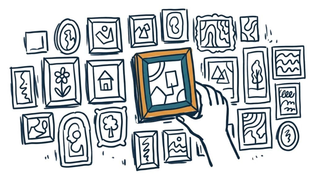
- Marker doodle. Hand-drawn, warm, a little imperfect; makes abstract ideas approachable. It’s the style used for the images on this site. Style line: “hand-drawn marker doodle style, casual imperfect strokes, friendly naive sketch, uniform single-weight marker lines, single ink colour on a plain background, one or two accent colours.”
Putting it to work
- Audit what you have. Gather your website images and last twenty posts in one folder. Name what’s there; usually it’s three or four styles fighting.
- Choose one primary style, at most one supporting one. Photography for proof, illustration or icons for concepts, is a common pair. More than two and you’re back to noise.
- Write the style line down. Put it in your brand guide next to your colors and fonts, and paste it into every image generation and every photographer brief. The prompt below produces it.
- Replace as you go. You don’t need to reshoot everything this week. New images follow the style from today; the old ones rotate out as pages get touched.
- Give it a season before judging. A style pays off through repetition. Three consistent months beats one perfect image.
One honest limit. A style can’t rescue weak subject matter. If your photos are blurry or your projects aren’t photographed at all, choose the style, then fix the pipeline that feeds it. The website imagery article walks through the four ways to source the images themselves.
Take this prompt with you
Copy this into ChatGPT, Claude, or Gemini and answer its questions.
Help me choose one imagery style for my brand and write it down so I can use it everywhere.

My business: [what you do and who buys it]

How I want customers to feel when they see my brand: [pick 2 or 3: welcoming, premium, honest, calm, playful, bold, nostalgic, expert]

What I can realistically produce: [be honest: "I have a photographer sometimes", "phone photos only", "AI-generated images only", "no photos of my work exist"]

What I'm showing most often: [physical work/products I can photograph, or invisible services/ideas]

Interview me: ask up to 5 follow-up questions, one at a time, to narrow the choice. Then recommend:

1. One primary imagery style, with a two-sentence explanation of why it fits my answers, and one style I should explicitly avoid and why.

2. A reusable AI style direction line for my primary style: one comma-separated sentence of visual language I can append to any AI image prompt to get consistent results.

3. If I need one, a supporting style for icons or graphics, with its own style direction line.

4. Three example image prompts in my new style for things my business would actually post, so I can test it today.

5. A one-paragraph imagery style entry I can paste into my brand guide: the style name, when to use it, and the direction line.

Keep the style achievable with what I said I can produce. If my mood words contradict each other or don't fit what I sell, say so and help me pick.